
“I just want something that looks nice.” It’s one of the most common briefs I receive — and it’s the brief that worries me the most. Because colour in branding is never just about looking nice. It’s about communicating something specific to a specific audience before a single word is read.
Colour is one of the most powerful non-verbal communication tools available to a brand. And choosing it based on personal preference alone is one of the most expensive mistakes a business can make.
What Colour Actually Does in a Brand
Research consistently shows that colour increases brand recognition by up to 80%. Before your audience reads your tagline, evaluates your services, or understands your pricing — they’ve already made an emotional judgement about your brand based on its colour palette.
That judgement happens in milliseconds. And it’s shaped by deep cultural associations, category conventions, and psychological responses that are largely consistent across audiences.
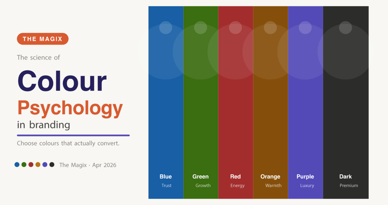
The Colours and What They Communicate
Blue communicates trust, reliability, and authority. It’s dominant in finance, healthcare, technology, and legal services — sectors where credibility is the primary purchase driver. If your business needs to be trusted before it can be loved, blue is often the right foundation.
Green communicates health, growth, nature, and sustainability. It works beautifully for wellness, food, organic products, and NGOs. In India specifically, green also carries associations of prosperity and new beginnings.
Red communicates urgency, energy, passion, and appetite. It’s no coincidence that so many food brands use red — it literally stimulates appetite. It also drives urgency, which is why it dominates sale banners and CTAs.
Yellow and Orange communicate warmth, optimism, creativity, and accessibility. They’re approachable and energetic — excellent for education, children’s brands, and businesses that want to feel friendly rather than formal.
Purple communicates luxury, creativity, spirituality, and wisdom. It’s been associated with royalty for centuries — and in 2026, it’s having a major moment in premium beauty, wellness, and creative industry branding.
Black and dark neutrals communicate sophistication, premium positioning, and authority. Used correctly, they signal that a brand takes itself seriously.
The Indian Context: Colour Means Something Different Here
Colour psychology isn’t universal — cultural context matters enormously. White, which communicates purity and minimalism in Western branding, is associated with mourning in parts of India. Saffron carries deep religious significance. Green is associated with Islam in some contexts.
When building a brand for an Indian audience, colour decisions need to account for these cultural layers — not just Western design conventions.
How I Choose Colours for Clients
My process always starts with three questions: Who is this brand speaking to? What do they need to feel to trust this brand? And what do the competitors look like — so we can stand out from them?
The answers to those three questions narrow the palette dramatically. From there, it’s about finding the specific hue, saturation, and combination that feels both strategically right and distinctly ownable.
Personal preference comes last, not first. And the result is a palette that does real work for the brand — not just one that looks nice.
📩 Ready to build a brand palette that actually converts? Let’s talk